

Ready to transform your product photos? Let’s talk about contrast – the secret ingredient that can take your images from “meh” to “wow.” Think of contrast as your photography superpower. It’s the difference between a photo that scrollers barely notice and one that makes them stop, click, and ultimately buy.
Every successful product photo tells a story, and contrast helps you tell it better. Picture a sleek watch catching the light against deep shadows, or a crystal-clear skincare bottle practically glowing with premium vibes. That’s contrast working its magic, helping you showcase what makes your products special. When you nail the contrast in your product photos, you’re creating experiences that connect with customers and make your online store stand out. So let’s explore the best ways to use contrast in product photography.
Why do we need contrast in product photography?

Photography’s most fundamental element, contrast, takes on special significance in product photography. It’s the art of highlighting differences – whether in tone, color, texture, or light – to make products stand out and capture attention in increasingly crowded digital marketplaces.
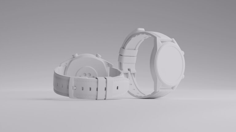
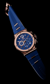
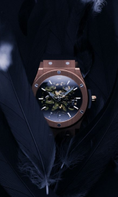
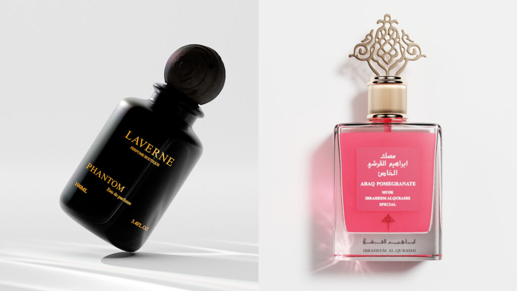
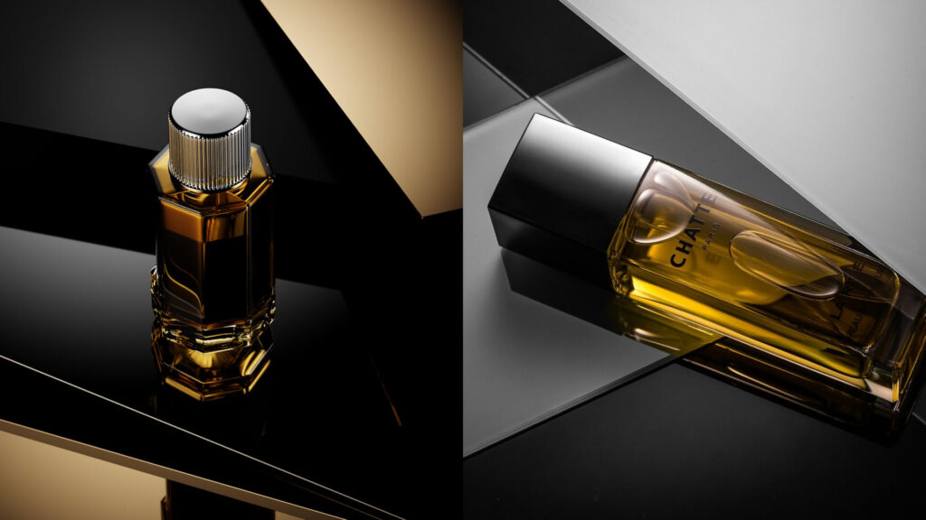
Let’s look at luxury products – they really shine when you play with dramatic contrast. Take a beautiful watch, for example. Place it against a dark background, and watch the magic happen: every polished surface catches the light, showing off the craftsmanship. You’ll see every detail pop, from the textured face to those gleaming hands – exactly what luxury buyers want to see before making their purchase.
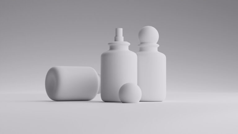
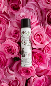
Skincare and beauty products need a different touch, but contrast is just as important here. These products look best against clean, bright backgrounds with just a hint of shadow. This style does two things perfectly: it shows off the product’s premium quality while keeping that fresh, clean look that beauty shoppers love. After all, when you’re selling products that promise to make people look and feel their best, your photos need to reflect that promise.
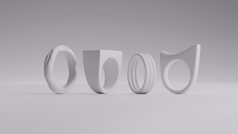
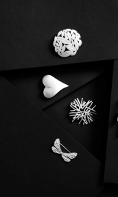
When it comes to fashion accessories, contrast can really make your products stand out. A leather bag looks even more luxurious when you capture the play between its smooth surface and textured details. And jewelry? It’s all about catching those perfect highlights against deeper shadows to show off every sparkle and finish. Good contrast helps your customers see exactly what makes each piece special – from the quality of materials to those little details that make it worth the price tag.
Contrast does more than just make products look good, though. It’s actually a key part of telling your brand’s story. When you keep your contrast style consistent across all your product photos, you create a look that customers start to recognize. It’s like giving your brand its own signature style that makes your whole online store feel polished and professional.
The psychology behind contrast in product photography runs deep. Studies in visual perception show that our brains are naturally drawn to areas of high contrast. You can leverage this biological predisposition to direct attention to key product features or create emotional responses that drive purchasing decisions.
Lighting techniques for optimal contrast

Light is the photographer’s primary tool for creating and controlling contrast in product images. Understanding how to manipulate light sources, shadows, and reflections can transform an ordinary product shot into a compelling visual story.
Professional product photographers often use a three-point lighting setup as their foundation. This classic arrangement uses key, fill, and backlights to create depth and dimension. The key light establishes the primary shadows, while the fill light softens them to prevent loss of detail. The back light separates the product from the background, creating that crucial edge definition that makes products appear three-dimensional in a two-dimensional medium.
Natural light photographers have discovered that even a single window can produce stunning contrast when used correctly. By positioning products at different distances and angles from the light source, photographers can achieve a wide range of contrast levels. Reflectors and diffusers become invaluable tools for fine-tuning these natural light setups.
Light modifiers play a crucial role in controlling contrast. Softboxes spread light evenly across large surfaces, reducing harsh shadows and creating a more balanced contrast suitable for cosmetics and personal care products. Conversely, grid spots and snoots concentrate light into focused beams, perfect for creating dramatic highlights on jewelry or watches.
The relationship between light position and product surface properties can’t be overstated. Glossy products require careful light placement to manage reflections and prevent blown-out highlights. Matte surfaces, on the other hand, often benefit from closer light sources to enhance surface texture through subtle contrast variations.
Here’s a cool trick with lighting: try mixing warm and cool light sources. It’s like painting with light temperatures – maybe a warm glow from one side and cooler light from another. This can make your products look more dynamic and set just the right mood. Just be careful not to go overboard — you still want your product colors to look true to life. After all, nobody wants to order a “white” shirt that turns out to be cream!
Creating depth through contrast techniques

Great product photography goes beyond surface appeal. It creates depth that draws viewers into the image. When you master contrast, your flat photos transform into something almost touchable, making products feel more real and engaging for online shoppers.
Think about lighting in layers. By creating subtle shifts from one area to another, you can guide the viewer’s eye naturally through the scene. This approach works especially well when you’re shooting multiple products together or creating lifestyle shots, where each item needs to stand out while still feeling part of a cohesive whole.
Here’s where it gets interesting: micro-contrast. These tiny differences in light and shadow around fine details and textures can make or break a professional shot. High-quality camera lenses excel at capturing these subtle variations, which is why some product photos look naturally three-dimensional, even before any editing takes place.
Your choice of background makes a huge difference in creating depth through contrast. While plain white or black backgrounds are e-commerce staples (and they work great!), don’t be afraid to experiment with subtle gradients or environmental elements. This is especially powerful for lifestyle products – sometimes a hint of context can make your product feel more premium and relatable.
Contrast bracketing is another pro technique that you can use. Think of it as taking multiple shots of the same product at different contrast levels, then blending the best parts of each. This way, you can keep all the tiny details in both the brightest and darkest areas of your image, creating photos with amazing depth.
Color plays a clever role in contrast too. It’s like a visual magic trick – warm colors naturally seem to come forward while cool colors feel further away. Even in a small studio space, you can use this to your advantage to create a sense of depth that makes your products really stand out.
Post-processing strategies to enhance contrast

Even if you nail your contrast while shooting, editing software can take your product photos to the next level. Today’s editing tools give you amazing control over every aspect of contrast – and it’s really worth learning how to use them.
Don’t stop at the basic contrast slider. That’s just scratching the surface. Dive into levels and curves, and you’ll discover a whole new world of possibilities. These tools let you fine-tune the darkest shadows, brightest highlights, and everything in between. The result? Photos that perfectly match your brand’s style while making your products look their absolute best.
Local contrast adjustments can really elevate your product photos with a few clicks. Tools like clarity, texture, and dehaze are game-changers for product photos. They let you bring out tiny details and textures without making the whole image look harsh. Got a leather bag with beautiful grain or a watch with intricate engravings? These tools are your best friends.
For those ready to level up their editing game, check out frequency separation. It sounds techy, but it’s actually pretty straightforward – it lets you work on a product’s texture separately from its tones. This means you can keep all those important surface details while getting the perfect contrast balance.
Want to get really precise? That’s where masking comes in. It’s like having a magic brush that lets you adjust contrast in specific areas only. You can make your product pop while keeping the background subtle and clean.
Don’t forget about color contrast – it’s just as important as light and dark. Playing with split-toning and color grading can help your products stand out while staying true to their real colors. Plus, consistent color contrast across your photos helps build a strong brand look.
Leveraging CGI for perfect contrast control

Let’s talk about CGI: it’s changing the game for product photography. Think of it as your digital photography playground where you have complete control over every detail, especially contrast. More and more e-commerce businesses are jumping on board, and for good reason.
Remember that tricky product shot that took hours to light just right? With CGI, those lighting challenges become simple clicks in 3D software. Even better, once you create the perfect lighting setup, you can save it and use it again and again. Your whole product line can look consistently amazing with zero effort.
Here’s where CGI really shines: imagine you’re launching a product in five different colors. Instead of scheduling five separate photo shoots, a digital artist can whip up all the variations in no time. Same perfect contrast, different colors – done! You save time, money, and get your products online faster.
Want to get creative? CGI lets you play around with endless possibilities. Try that product against a dark background, then a light one. Amp up the contrast, then tone it down. No studio rentals, no equipment setup – just pure creativity until you find that perfect look that makes your marketing team high-five each other.
It’s a game-changer for product customization too. Customers can see exactly how that watch looks with a leather strap versus metal, or how that sofa appears in different fabrics. Every version shows up with perfect contrast that highlights all the right details.
The best part? Major e-commerce platforms love CGI because it keeps everything looking polished and professional. Whether you’re selling jewelry or furniture, every product in your catalog can maintain that same high-quality look that customers trust.
Wrapping up


Remember, nailing contrast isn’t something that happens overnight – it’s a skill you’ll keep building as you experiment and grow. But here’s the exciting part: whether you’re shooting with a camera or diving into CGI, getting contrast right can be the difference between photos that sell and photos that just… sit there.
The best part about product photography right now? You’ve got options! Mix up traditional photography tricks with cool new tech, and you’ll create product images that not only look amazing but actually get customers clicking ‘add to cart.’ So grab your camera (or fire up that 3D software), and start playing with contrast – your products deserve to shine!
FAQ
What’s the ideal contrast level for product photography?
The ideal contrast level varies depending on your product type and brand aesthetic. Luxury items often benefit from higher contrast ratios, while softer contrast suits cosmetics and personal care products. The key is maintaining consistency across your product line while ensuring important details remain visible.
How can I improve contrast when working with limited equipment?
Focus on maximizing natural light, use simple reflectors or diffusers, and consider investing in a basic lighting kit. Post-processing tools can also help enhance contrast when working with limited resources.
Does increasing contrast always improve product photos?
Not necessarily. Too much contrast can make images appear unrealistic or harsh. The goal is to find the right balance that enhances product features while maintaining a natural, appealing look.
How does contrast affect mobile viewing?
Mobile devices often display images differently than desktop monitors. Test your images across different devices and adjust contrast levels to ensure they look good on all screens. Consider that many mobile viewers may use auto-brightness settings.
What’s the best way to maintain consistent contrast across a product line?
Develop a clear set of guidelines for both photography and post-processing. Document your lighting setups, camera settings, and editing parameters. For CGI production, save and reuse lighting presets to ensure consistency.


