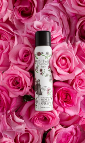
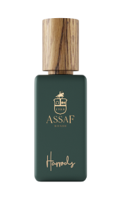
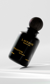
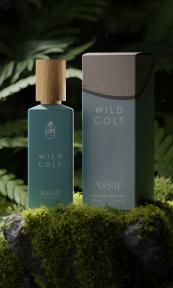
In this example we will look at the perfume bottle and see how further experimenting can achieve an interesting and unique still life photograph. Similarly, this was done in a recent shoot I did through photographing a perfume box. I felt like the outcome was a true work of still life art. You can see more of that here.
Still life photography is an interesting genre and one I am very much fascinated by. If you are familiar with my previous works you will notice that still life is something that I very much prefer to photograph. The thing I love about still life is the ability to turn something ordinary into something not ordinary.
Perfume Bottle Photography Procedure
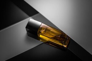
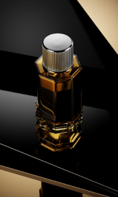
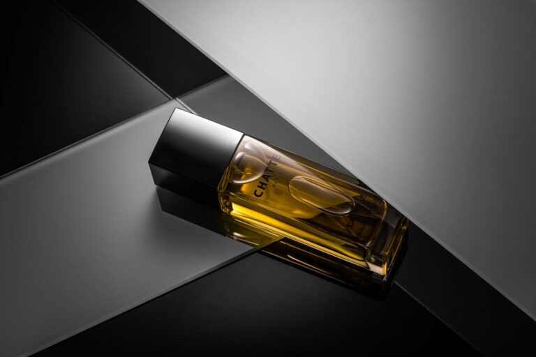
In this image I have unboxed the product and decided to shoot the perfume bottle by itself. This particular perfume bottle was complemented by everyday objects to create a compelling scene. Most noteworthy, in this particular image is that I challenged myself to create the atmosphere using just a single light source (which is not an easy feat in photography). Below I shall break down the process and detail the steps involved.
Above all, I tried to use reflective materials to create this scene. At the bottom of the image you can notice a plain black painted glass. This formed the base. In contrast to the dark tones, I employed white frosting glass, you can see the shadows created from the difference. The strips of frosted glass, similarly, created an interesting play on the light.
A member of an online community where I have my work usually critiqued, described the final result as something a ‘client would say: “can I see my brand more pronounced, please??’. I always enjoy these sorts of conversions. Yes, this this was just an experiment but I had left the branding less visible intentionally. I think this alone forces the viewer to really explore and discover what the brand is. It kind a makes you stop and task you in. It almost forces you to look closer and you are in a way making sure, you see it right.
Final Result
A lot of the results in the photograph are natural, such as the bubbles in the perfume bottle. I played with it for some time to adjust their positioning and think the outcome was great. The online community of commercial photographers had mixed responses to this, with some stating that the bubbles don’t fit in or shouldn’t be present. I guess it’s a personal preference and I am happy with the way the results have come out and they may actually the only thing I like about this image.
What do you think of the image and the points discussed above? Please leave your comments below or on social media.
FAQs
What type of light should I use for a one-light setup when photographing a perfume bottle?
When setting up a one-light setup for photographing a perfume bottle, it is recommended to use a softbox or diffused light source to create soft and even lighting. A large modifier like a softbox will help diffuse the light, avoid harsh shadows, and reduce glare on the glass.
How should I position the light for the best results?
Position the light source at a 45-degree angle to the perfume bottle to add depth and dimension to the image. Experiment with the placement of the light source to find the best angle that highlights the curves and shape of the bottle.
How can I enhance the appearance of the perfume bottle in post-processing?
Adjusting brightness, contrast, and saturation can help improve the appearance of the perfume bottle in post-processing. Use a brush tool to selectively lighten or darken certain areas of the image to highlight specific details. Also, remove distracting reflections or blemishes on the bottle with a clone or correction tool.

