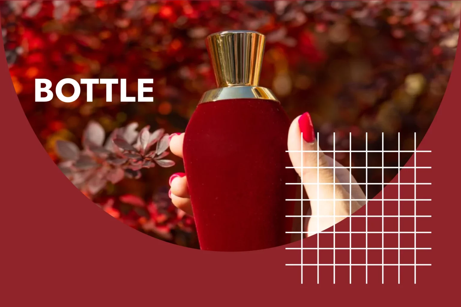

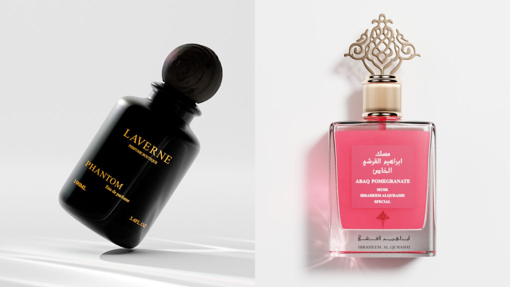
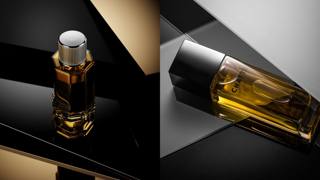
Perfume bottle photography is all about putting perfume bottles in perspective and highlighting their unique design, color, and texture. It plays a crucial role in the marketing and promotion of perfumes, as it helps you create a strong visual identity.
One of the main reasons why perfume bottle photography is so important is its ability to evoke emotion and capture the attention of potential buyers. A well-crafted photo can make your perfume bottle appear elegant, luxurious, or even mysterious – qualities often associated with high-end fragrances.
High-quality perfume bottle photography allows for effective brand storytelling. By showcasing elegant design, refined details, and luxurious packaging, these images create an emotional connection with consumers. You can easily evoke desire and longing, so people are more likely to associate your fragrance with sophistication and elegance. With that being said, let’s take an in-depth look at how you can transform your perfume bottle photography into a work of art!
1. Essential equipment and setup

Wondering what the best equipment and setup are to add to your perfume bottle photography efforts? Browse through this easy-to-follow list! Alos, check out equipment for Cosmetic product photgoraphy.
Camera
When it comes to capturing the intricate details and beauty of perfume bottles, choosing the right camera is critical. With countless options on the market, finding the best camera for perfume bottle photography can be overwhelming. However, there are a few key factors you should consider when narrowing down your options. Image quality should be your top priority. Look for a camera with high resolution and excellent dynamic range to ensure sharpness and accurate colors in your photos, such as a DSLR.
Lens
The ideal lens for this perfume bottle photography is usually a macro lens. With a macro lens, you can capture intricate details with exceptional clarity and sharpness, which is crucial when you want to highlight the unique design and texture of perfume bottles. With a macro lens, you can fill the frame with the bottle while maintaining accurate proportions and minimal distortion.
Lighting

Lighting can bring out the colors, textures, and details in your perfume bottle photography, creating stunning images that captivate the viewer. Typically, natural light is a photographer’s best friend when it comes to shooting perfume bottles. The soft and diffused light from a window or skylight can create beautiful highlights and shadows on the surface of the glass, bringing out the intricate design of the bottle.
Tripods for stabilization
The best tripod for perfume bottle photography should offer stability, versatility, and precise control over the position of your camera. Stability is crucial to avoid unwanted shake or blur in your images, and a stable tripod will ensure that your shots are sharp and well-defined. Versatility is another important factor when choosing a tripod for perfume bottle photography. Look for a model that is easy to adjust in height and allows you to rotate and tilt the camera at different angles. This flexibility allows you to capture different compositions and perspectives, adding interest and creativity to your images.
2. Styling and props

When choosing props, it is significant to consider the key elements of the perfume, such as its ingredients or theme. For example, if the perfume contains floral notes, the inclusion of fresh flowers in the composition can greatly enhance the visual appeal of the perfume and convey its essence to the viewer. Similarly, if a perfume has a modern and edgy appeal, simple and minimalist props such as geometric shapes or metallic accents can complement the brand’s aesthetic.
In addition to props, picking an appropriate background is also crucial to capturing the desired mood and style of perfume bottle photography. The background should not smother or distract from the main subject, but rather highlight it. A neutral background can provide a clean canvas to show off the intricate details of the bottle design or highlight bright colors without creating visual clutter.
By placing bottles with bold or vibrant colors against a background of neutral tones or patterns, photographers can draw attention to the uniqueness of each perfume’s design. Similarly, combining textured caps with smooth packaging materials can create an interesting position that visually enhances the photo.
3. Composition and Framing
The rule of thirds is one of the most important rules for making images look good. This compositional principle involves dividing the image into a grid of nine equal parts, with two horizontal and two out of four vertical lines intersecting. If you put the perfume bottle or label at these points, you make the photo look balanced and interesting.
Another critical guide to creating stunning perfume bottle images is to consider negative space. Negative space refers to the empty areas around the main subject that can be used strategically to enhance the composition. A generous amount of negative space around the perfume bottle not only allows the viewer to focus on the product, but also adds a sense of elegance and sophistication to the image.
Selecting appropriate angles and perspectives to highlight key features of the perfume product
Choosing the right angles and perspectives is critical. The way you position and frame the bottle can have a significant impact on how its key features are highlighted. An effective approach is to experiment with different angles to find the one that best shows off the bottle’s unique design elements. For example, shooting from a low angle can make the bottle appear larger and more elegant, while a high angle can highlight its curves and contours.
Another aspect to consider is perspective. By choosing your angle carefully, you can draw attention to the details of the perfume bottle. The intricate patterns or embellishments on the top of the lid could be seen from above, while a side view would highlight the shape and silhouette of the entire bottle.
Framing techniques to create depth and visual interest in the photographs

An effective technique for creating depth and visual interest in your photos is framing. Framing refers to how you position or frame your subject in the photo, using objects or elements in the foreground or background to create a sense of depth.
One way to use framing when photographing perfume bottles is to place the bottle against a textured or patterned background. This phenomenon has the potential to alter the appearance of the bottle’s amorphous surface in contrast to the intricate details of the background, resulting in a larger and more intricate photograph. Another method is to use natural elements like flowers, leaves, or branches as frames around your perfume bottle. You can make a good composition by putting these elements around your subject.
4. Lighting Techniques
Perfume bottle photography is a highly specialized genre that requires one essential element: natural lighting. Natural light has the unique ability to highlight the intricate details of a perfume bottle and enhance its beauty and appeal.
Avoiding harsh, artificial lighting when snapping pics of perfume bottles is crucial, as it can leave behind unsightly shadows or glare on the glass. Natural light, on the other hand, provides soft and diffused lighting that brings out the true colors and textures of the bottle. It adds depth and dimension to the photo and makes it more visually appealing. Natural light also allows photographers to capture the subtleties of design elements such as embossing or engraving on perfume bottles.
Studio lighting setups

Are you a perfume bottle photographer who wants to take stunning pictures that truly capture the essence of your fragrance? Studio lighting specifically tailored for perfume bottle photography is a must. The best lighting for this type of photography is a combination of natural light and artificial lighting techniques. The glow of the sun softens the scent and highlights the perfume bottle, while the glow of the artificial light enhances the play of shadows and highlights.
When photographing perfume bottles, it’s important to place them near a window or other natural light source. This creates a beautiful play of light and shadow on the surface of the bottle, highlighting the design features and textures. It can be difficult to use only natural light because it changes throughout the day, making it hard to get the same amount of light every time. To overcome this challenge, photographers often use additional artificial light sources such as light boxes or diffusers to fill in the light and reduce harsh shadows.
5. Product Retouching and Editing
Post-processing techniques play a critical role in enhancing the colors, textures, and details of perfume product photographs. Using techniques called post-processing, photographers can make their pictures look more interesting by adding bright colors, intricate textures, and fine details.
One popular technique for enhancing colors is adjusting the saturation level. This allows photographers to boost or tone down certain hues to achieve the desired vibrancy without sacrificing realism. In addition, contrast adjustments can be made to highlight textures and create a more dramatic effect. By meticulously selecting focus areas and employing targeted sharpening techniques during post-processing, photographers can effectively highlight even the smallest details on perfume bottles, such as engraved logos or intricate patterns.
Removing imperfections and distractions through retouching and cloning

Imperfections and distractions often find their way into the image detail and detract from the overall impression of the image. This is where retouching and cloning techniques come in. They help the photographer take out things that don’t belong and make perfect pictures that show the essence of the scent.
When retouching perfume bottles, precision is key. First, look carefully at the picture and find any mistakes or things that need to be removed. These can include dust particles, scratches on the glass, or even fingerprints on the surface of the bottle. Use software like Adobe Photoshop to zoom in on these areas and make precise adjustments using tools like healing brushes or clone stamps.
Cloning is another powerful technique you can use to enhance perfume bottle photography by eliminating distractions while maintaining a natural look. It’s possible to remove annoying imperfections like scratches or stains on the glass surface with this technique.
Maintaining a natural and authentic look while enhancing the overall visual impact
When it comes to improving the overall visual impact of these photos in post-processing, it’s important to maintain a natural and authentic look. By following a few key techniques, you can enhance your perfume photos while preserving the true beauty of the scent.
To achieve an authentic look, it’s essential to start with high-quality images. Make sure your first shots are properly exposed and focused, capturing all the details of the perfume bottle. This will give you a good idea of how to finish the picture without sacrificing its quality or appearance. When you edit your photos, be careful not to do too much retouching or change the colors too much. This can make your photos look fake.
6. Composition and product photography tips

Highlighting key elements of perfumes, such as bottle shape, labels, and packaging details, plays a big role in enhancing your imagery. By effectively showcasing these elements, photographers can create visually appealing images that draw consumers in and convey the unique qualities of each perfume.
To highlight the bottle shape when photographing perfume bottles, it’s important to pay attention to lighting and angle. Soft lighting can emphasize the curves and lines of the bottle, while dramatic lighting adds depth and intrigue. Experimenting with different camera angles can also provide interesting perspectives on the silhouette and overall design of the bottle. Labels are an additional crucial aspect to emphasize when photographing perfume bottles, and this can be easily accomplished by utilizing the appropriate lighting and background.
Utilizing negative space to draw attention to the product and create a clean, minimalist composition
The use of negative space can be a powerful way to draw attention to the product and create a clean, minimalist composition. Negative space refers to the empty areas surrounding the main subject of the photo. By leaving a little space around the perfume bottle, you can make your composition feel balanced and harmonious.
A good way to avoid using negative space is to not center the perfume bottle. This technique leaves room to breathe around the main subject and draws attention directly to it. Also, use a simple background with neutral colors or gradients that won’t distract from the bottle itself. This way, you’ll create an elegant and sophisticated look that will highlight the beauty and design of the perfume bottle.
Showcasing the perfume in context
An effective way to present perfume in context is to include props that complement its scent and story. If you’re snapping a floral scent, for instance, you should scatter a few blooms or petals around the bottle to create a striking and cohesive picture.
Choosing an appropriate background is an important aspect of presenting the perfume in context. The background should reflect the mood, theme or ingredients of the fragrance. For example, if you’re photographing a summer beach fragrance, you should choose a sandy beach or ocean background to transport the viewer to that world. By carefully considering these details, you can enhance your perfume bottle photos and create captivating images that will resonate with potential customers.
7. Tips for DIY Perfume Product Photography

Perfume bottle photography can be an expensive endeavor, especially if you’re just starting out or working with a tight budget. However, there are several budget-friendly alternatives that can help you achieve professional-looking results without breaking the bank. One option is to use natural light instead of investing in expensive studio lighting. If you put your perfume bottles near a window or take pictures outside during the golden hour, the light will be soft and diffused, which will make the details in your bottles stand out.
Another cost-effective alternative is to craft your background. You don’t have to spend a lot of money on fancy backgrounds made for perfume bottle photography, you can play around with whatever you have at home or at the nearby stores. For example, a simple white bedsheet or a large piece of foam board as a background can provide a clean and elegant look to your photos.
DIY light boxes and makeshift studios for capturing professional-looking product images at home
Let’s start with the DIY light box. This is an inexpensive solution that provides diffused lighting for soft yet vibrant images. First, find a cardboard box large enough to hold your perfume bottle. Cut out three sides of the cardboard, leaving only one frame. Cover these openings with translucent material like tracing paper or thin fabric. Place a white poster board in the box as a backdrop, and place two desk lamps on either side of the box to provide even lighting.
Having your own makeshift studio is a great way to take high-quality photos without breaking the bank. With a few simple tips and tricks, you can easily set up an affordable and effective setup for perfume bottle photography.
Lighting is crucial when it comes to capturing the beauty of perfume bottles. Natural light is ideal, so try to place your temporary studio near a large window or glass door. If natural light isn’t available, invest in some inexpensive LED lamps that create a soft and diffused light. Place these lights at different angles around your setup to minimize shadows and highlight the intricate details of the bottles.
Smartphone photography tips for capturing high-quality perfume product photos


When it comes to presenting perfume products, high-quality photography is essential for appealing to potential customers. With the advent of smartphones equipped with advanced cameras, anyone can now take professional-looking pictures without needing expensive equipment.
First, natural light is ideal because it brings out the true colors and details of the product. Find a well-lit spot near a window or go outside to take advantage of the soft natural light. Avoid flash, as it can cause harsh shadows or reflections on the surface of the bottle. Second, composition is key to creating visually appealing images. Experiment with different angles and perspectives to see what works best for each bottle. Finally, make sure you use the right props and backgrounds and choose the appropriate camera settings.
Wrapping up
Perfume bottle photography is an art form that requires precision, creativity, and attention to detail. It allows you to showcase their products in a visually stunning way, enticing consumers with the promise of luxury and elegance. However, as technology continues to advance, CGI (computer-generated imagery) offers a more cost-effective and versatile alternative to traditional perfume bottle photography.
With CGI, you can create lifelike images that can be easily manipulated and adapted for various marketing platforms. Additionally, CGI eliminates the need for physical props and sets, saving time and resources. As technology continues to evolve, it is clear that CGI is the future of perfume bottle photography, providing endless possibilities for creative expression and captivating visuals. So, what are you waiting for? Get started now and improve your imagery!
FAQ
What is perfume bottle photography?
Perfume bottle photography refers to the art and technique of capturing visually appealing and captivating images of perfume bottles. It involves various elements such as lighting, composition, styling and post-processing to create stunning images that highlight the beauty and essence of the perfume.
What equipment do I need for perfume bottle photography?
To start photographing perfume bottles, you’ll need a digital camera (DSLR or mirrorless) with interchangeable lenses, a sturdy tripod, lighting equipment, a white or neutral background, props and styling tools, and image editing software for post-processing.
How do I style a perfume bottle for photography?
When designing the perfume bottle, shape, color and branding elements must be considered. You can experiment with different props, backgrounds and complementary elements to create a visually appealing composition. Pay attention to the overall aesthetic, balance, and story you intend to convey with the image.


