

Captivating product photography is crucial in the world of e-commerce and visual marketing. Among the different styles and techniques, shooting products against a black background is particularly effective in creating drama, contrast, and sophistication. In this comprehensive guide, we will explore the intricacies of mastering the art of product photography on black backgrounds. We will cover essential equipment, lighting setups, and techniques to help you create visually stunning images that will captivate your audience.
The power of black background product photography

Product photography against a black background is a versatile technique used across various industries and contexts to showcase products in a visually striking and sophisticated manner. Here are some common scenarios where black background product photography is employed:
E-commerce Websites
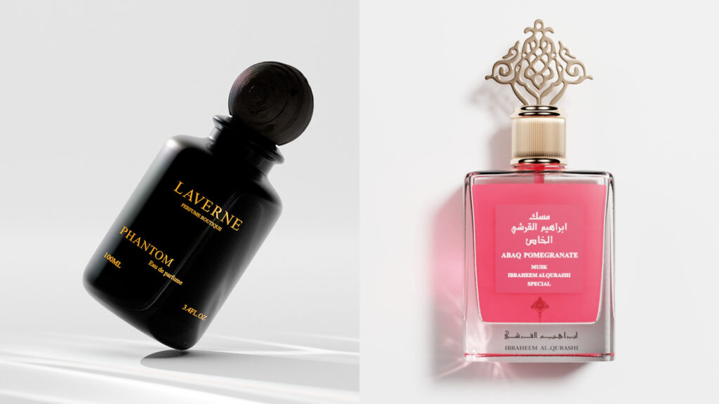
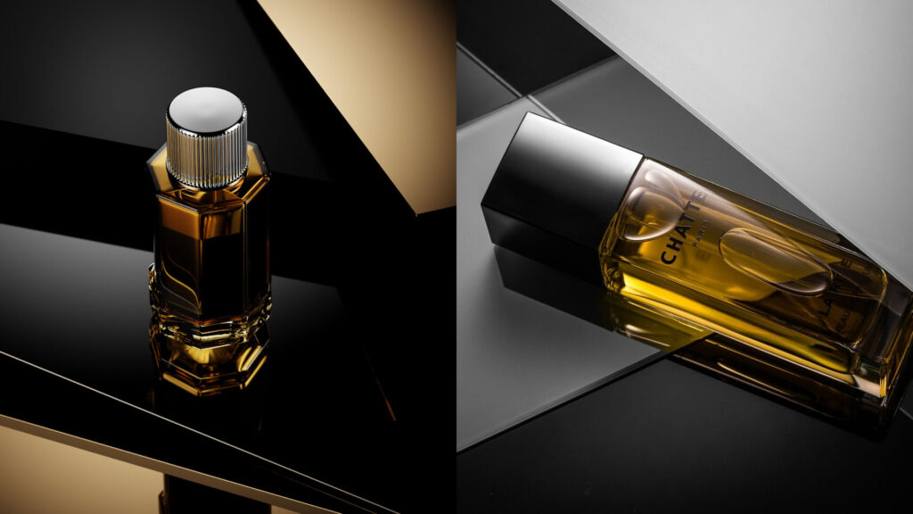
Many e-commerce platforms and online marketplaces use product images against black backgrounds to create a consistent and visually appealing aesthetic. The contrast helps products stand out prominently, drawing the viewer’s attention to key features and details. This approach is especially effective for highlighting high-end or luxury products, as it conveys a sense of elegance and refinement.
Print Marketing Materials
Black background product photography is also prevalent in print marketing materials such as brochures, catalogs, and advertisements. By isolating products against a black backdrop, marketers can create eye-catching visuals that command attention and leave a lasting impression on potential customers. This technique is commonly used in industries such as fashion, cosmetics, and consumer electronics to convey a sense of sophistication and style.
Social Media Campaigns
On social media platforms like Instagram, where visual content plays a crucial role in engagement and brand promotion, this can help brands stand out in crowded feeds. Captivating images against black backgrounds has a high shareability factor and is more likely to grab users’ attention as they scroll through their feeds. This technique is particularly effective for product launches, promotions, and sponsored posts.
Product Packaging
Black background is also utilized in product packaging design to showcase products on labels, boxes, and promotional materials. By presenting products against a black background, brands can create packaging designs that are visually striking and memorable, enticing consumers to purchase their products. This approach is commonly seen in the beauty, beverage, and tech industries, where packaging aesthetics are crucial for attracting customers.
Artistic and Creative Projects
Beyond commercial applications, black background is also used in artistic and creative projects to experiment with lighting, composition, and visual storytelling. Photographers and artists often use this technique to create visually stunning images that evoke mood, emotion, and atmosphere. From fine art photography to conceptual projects, black background product photography offers endless opportunities for creative expression.
In summary, black background product photography is a versatile technique employed in various contexts, including e-commerce, print marketing, social media campaigns, product packaging, and artistic endeavors. Its ability to create dramatic contrast, draw attention to products, and convey a sense of sophistication makes it a popular choice for brands and creatives alike.
Essential equipment

Before delving into the intricacies of lighting and composition, it’s essential to equip yourself with the right tools for the job. In product photography, the choice of equipment can significantly impact the quality and visual appeal of your images, especially when shooting against a black background. Let’s explore the essential gear every photographer needs to master the art of capturing captivating product images in this style, along with relevant examples showcasing their usefulness.
Camera Gear
Investing in quality camera gear is the foundation of successful product photography on black backgrounds. A DSLR or mirrorless camera with manual shooting capabilities provides precise control over exposure, focus, and other settings, ensuring your images are sharp and well-exposed. Pair your camera with high-quality lenses featuring a wide aperture (f/2.8 or lower) to achieve beautiful and selective focus, drawing attention to key features of your products.
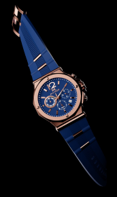
Suppose you’re photographing a luxury watch against a black background. A high-resolution DSLR paired with a prime lens with a wide aperture allows you to capture intricate details of the watch face while blurring the background, creating a sense of depth and luxury.
Tripod
A sturdy tripod is indispensable for product photography, especially when shooting on black backgrounds where precise composition and stability are crucial. By keeping your camera steady, a tripod ensures sharp images and allows for longer exposure times, perfect for achieving optimal lighting conditions without the risk of a camera shake.
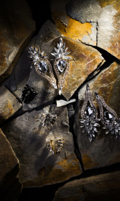
When photographing small products like jewelry or electronics, a tripod enables you to maintain consistent framing and focus across multiple shots, essential for creating cohesive product catalogs or online listings.
Lighting Equipment
Effective lighting is the key to creating captivating product images on black backgrounds. Investing in off-camera lighting equipment such as studio strobes or continuous lights provides versatility and control over the lighting environment. Softboxes, umbrellas, or diffusers help create soft, even lighting that highlights your product’s features without harsh shadows, enhancing its visual appeal.
For example, when photographing a bottle of premium skincare serum against a black backdrop, softbox lighting positioned at a 45-degree angle creates gentle highlights and shadows, emphasizing the product’s sleek packaging and luxurious texture.
Black Backdrop
Selecting the right backdrop is essential for creating a seamless, elegant background that enhances your product’s visual impact. Choose a matte black backdrop made of fabric or paper to eliminate distractions and create a dramatic contrast against your product. Ensure the backdrop is large enough to accommodate your product and allows for flexibility in composition.
When photographing a set of matte black kitchen knives, a black fabric backdrop creates a sleek, uniform background that accentuates the knives’ sharp edges and reflective surfaces, resulting in striking product imagery.
DIY black background photography at home

Obtaining a black background at home for photography doesn’t necessarily require expensive equipment or a dedicated studio space. Here are several cost-effective methods to achieve it:
- Black Fabric or Paper – One of the simplest and most versatile options is to use black fabric or paper as a backdrop. You can purchase a large piece of black fabric from a craft store or repurpose a black bed sheet or tablecloth. Alternatively, black seamless paper rolls are affordable and readily available from photography supply stores. Hang the fabric or paper behind your subject to create a seamless black background.
- Black Foam Board or Poster Board – Another budget-friendly option is to use black foam board or poster board as a backdrop. These lightweight and portable materials can be easily positioned behind your subject to create a solid black background. Arrange multiple boards to cover a larger area if needed.
- Painted Wall – If you have a wall in your home that can be painted, consider painting it with matte black paint to create a permanent black background. This option requires some preparation and cleanup but provides a seamless and consistent backdrop for your photography.
- Natural Environment – For smaller subjects or still-life photography, you can create a black background using the environment around you. Position your subject against a naturally dark or shaded area, such as a dark-colored wall, doorway, or corner of a room. Adjust your camera settings and lighting to minimize distractions and emphasize the background.
- Editing Software – If you’re unable to achieve a perfectly black background during the shooting process, you can always use editing software such as Adobe Photoshop or Lightroom to darken the background further or remove unwanted elements. Use tools like the Levels or Curves adjustment layers to adjust the brightness and contrast of the background, or use the selection and masking tools to isolate the subject and replace the background entirely.
- Lighting Considerations – Regardless of the method you choose, proper lighting is essential for achieving a solid black background. Position your subject away from the background to minimize spillage of light onto the backdrop, which can result in a grayish or uneven background. Use directional lighting such as softboxes, umbrellas, or even natural light to illuminate your subject while keeping the background dark and shadow-free.
By utilizing these simple and cost-effective methods, you can easily create a black background at home for your photography projects, whether you’re capturing product shots, portraits, or still-life compositions. Experiment with different materials and lighting setups to achieve the desired look and feel for your images.


Lighting setups: crafting the perfect atmosphere
Once you’ve gathered the necessary equipment, mastering lighting setups is the next step toward creating visually stunning product images on black backgrounds. Here, we’ll explore some lighting arrangements and their effects on highlighting your products’ features and enhancing their visual appeal.
Single Light Source – A single light source setup is a versatile option for product photography on black backgrounds. By positioning a softbox or umbrella slightly above and to the side of your product, you can create soft, directional lighting that adds depth and dimension to your images.
Imagine you’re photographing a vintage camera against a black backdrop. By using a single softbox positioned above and to the side of the camera, you can cast gentle shadows that accentuate the camera’s contours and textures, creating a sense of nostalgia and sophistication.
Backlighting – Backlighting is an effective technique for creating dramatic silhouettes and emphasizing your product’s shape against a dark background. Place a light source behind and slightly above your product to create a halo effect, outlining its contours while maintaining a dark, moody atmosphere.
Consider photographing a glass bottle of premium whiskey against a black backdrop. By backlighting the bottle, you can create a captivating silhouette that highlights its elegant shape and golden hue, evoking a sense of luxury and refinement.
Rim Lighting – Rim lighting involves placing lights on either side of your product, slightly behind it, to create a subtle glow along its edges. This technique adds dimension and separation, effectively highlighting your product against the background.
Suppose you’re shooting a pair of designer sunglasses against a black backdrop. By using rim lighting, you can create a soft, halo effect around the edges of the sunglasses, accentuating their sleek frames and making them stand out against the dark background.
Each lighting setup offers unique advantages for showcasing your products in the best possible light. Experimenting with different arrangements allows you to discover the perfect balance of light and shadow, enhancing your product’s visual appeal and capturing the attention of your audience.
Effective Lighting Techniques: Elevating Your Product Imagery
Beyond mastering lighting setups, incorporating effective lighting techniques is essential for creating captivating product photography. Let’s explore some advanced techniques to enhance your images and highlight your products’ features.
Adjusting Light Intensity
Fine-tuning the intensity of your lights allows you to control the contrast and drama in your images. By adjusting the brightness of your main light source relative to fill lights or ambient light, you can create striking contrasts that draw attention to your product.
When photographing a sleek smartphone against a black background, for instance, adjusting the main light source to be slightly brighter than the fill light enhances the phone’s reflective surfaces and sharp edges, creating a dynamic and visually appealing image.
Controlling Reflections
Reflections on glossy or reflective surfaces can distract from your product’s features. Utilize flags, diffusers, or reflective panels to control and redirect light, minimizing unwanted reflections and ensuring the focus remains on your product.
Suppose you’re photographing a shiny silver necklace against a black backdrop. Placing a flag between the light source and the necklace helps control reflections, allowing you to capture the necklace’s intricate details and textures without distracting glare.
Light Painting
Light painting involves selectively illuminating specific areas of your product using a handheld light source. This technique is particularly useful for highlighting intricate details or textures and adding emphasis to key features.
Imagine you’re photographing a handcrafted ceramic vase against a black background. Using a small LED flashlight, you can selectively paint light onto the vase’s intricate patterns and textures, creating a mesmerizing interplay of light and shadow that enhances its visual appeal.
Use advanced lighting techniques to improve your product photography. Be creative and experiment to create visually stunning images that captivate your audience.
Post-processing tips: enhancing your product imagery

While capturing the perfect shot is essential, post-processing plays a crucial role in refining and enhancing product images, particularly when shooting against a black background. Here are some advanced post-processing techniques to elevate your product photography:
- Adjusting Contrast and Exposure – Fine-tuning the contrast and exposure levels in your images is vital for ensuring your product stands out against the black background. Utilize adjustment layers or curves in software like Adobe Photoshop or Lightroom to selectively enhance contrast and brightness, highlighting key features and textures while maintaining a balanced overall exposure.
- When photographing a sleek black smartphone against a black background, adjusting the contrast slightly can help differentiate between the phone’s glossy surface and the background, enhancing its visual appeal and making it pop.
- Removing Blemishes and Imperfections – Carefully inspect your images for any blemishes, dust, or imperfections that may detract from your product’s presentation. Utilize cloning, healing, or spot removal tools to clean up distractions and ensure a polished final image that showcases your product in its best light.
- If you notice dust particles or smudges on a product’s surface in your images, use the cloning tool to seamlessly remove them, leaving behind a flawless representation of your product.
- Enhancing Colors and Tones – Experiment with color grading and tonal adjustments to enhance the vibrancy and richness of your product’s colors. Adjust hue, saturation, and luminance levels to achieve a balanced, visually appealing color palette that complements your product’s aesthetics.
- When photographing a vibrant bouquet against a black backdrop, increasing the saturation of certain hues can make the colors pop, creating a striking contrast against the dark background.
- Adding Depth and Dimension – Utilize techniques such as dodging and burning to add depth and dimension to your images. By selectively enhancing highlights and shadows, you can create a sense of volume and texture, making your products appear more three-dimensional and lifelike.
- When photographing a textured fabric against a black background, use dodging and burning techniques. This will help you selectively lighten and darken areas that can accentuate the fabric’s texture, creating a more tactile and immersive viewing experience.
- Optimizing for Web and Print – Consider the final destination of your images, whether it’s an e-commerce website or print marketing materials. Resize and sharpen your images accordingly to ensure they maintain optimal quality and clarity across different platforms, maximizing their impact and engagement with your audience.
Before uploading product images to your online store, resize them to the appropriate dimensions and apply sharpening to enhance details and ensure crispness, ensuring a professional presentation that entices potential customers.
By incorporating these advanced post-processing techniques into your workflow, you can refine your product images and ensure they look their best, ultimately enhancing their visual impact and driving engagement with your audience.
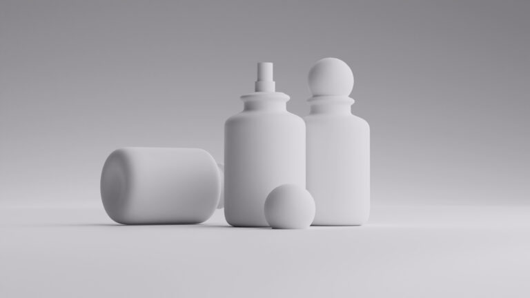
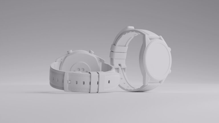
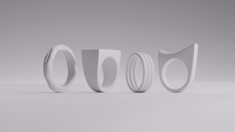
Advantages of 3D assets and CGI

3D assets and CGI have transformed product photography, offering new possibilities. These digital tools are versatile and ideal for creating captivating imagery on a black background. Let’s explore their benefits for product photography.
Complete Control: With 3D assets and CGI, photographers have complete control over every aspect of the scene, including lighting, camera angles, and product placement. This level of control allows for precise adjustments and experimentation, ensuring that every element of the image is optimized for maximum visual impact.
Consistency: 3D assets and CGI enable you to create perfectly consistent images, eliminating variations in lighting, composition, and product positioning that may occur in traditional photography. This consistency is particularly valuable for e-commerce platforms and product catalogs, where uniformity is essential for maintaining a cohesive brand image.
Flexibility: Unlike traditional photography, where reshooting may be necessary to make changes to the image, 3D assets and CGI offer unparalleled flexibility. Photographers can easily make adjustments to the product’s appearance, such as color, texture, and size, without the need for costly reshoots or extensive post-processing.
Creativity: 3D assets and CGI provide photographers with virtually limitless creative possibilities, allowing them to explore imaginative concepts and visual styles that may be challenging or impossible to achieve with traditional photography. From surreal and fantastical scenes to hyper-realistic product renderings, the only limit is the photographer’s imagination.
Cost-Effectiveness: While the initial investment in 3D modeling software and resources may be significant, the long-term cost-effectiveness of 3D assets and CGI can outweigh that of traditional photography. Once created, 3D assets can be reused and repurposed for multiple projects, reducing the need for costly photo shoots and product staging.
Differentiation from traditional photography

You might be wondering what the differences are between a digital product and a photoshoot and a traditional one. Here are some of the most important ones.
Realism vs. Artifice: While traditional photography aims to capture the realism and authenticity of a physical product in a real-world setting, 3D assets, and CGI offer a degree of artifice and stylization. This distinction allows photographers to create images that transcend reality, offering viewers a unique and immersive visual experience.
Technical Skill vs. Technical Knowledge: Traditional photography relies on the photographer’s technical skill in manipulating cameras, lighting, and composition to capture compelling images. In contrast, 3D assets and CGI require technical knowledge of 3D modeling software and rendering techniques to create and manipulate virtual scenes and products.
Time Investment: Creating high-quality 3D assets and CGI requires a significant time investment in modeling, texturing, lighting, and rendering. While traditional photography may offer more immediate results, the meticulous attention to detail and customization available with 3D assets can ultimately result in stunning and impactful images.
In short, 3D assets and CGI are advantageous for black background product photography, providing photographers with control, consistency, flexibility, creativity, and cost-effectiveness. These technologies offer innovative opportunities for visual storytelling in the digital age.
Wrapping up
Mastering black background product photography requires attention to detail, creativity, and technical expertise. Understand essential equipment, lighting setups, and techniques to create stunning images that showcase your products and captivate your audience. Experiment, practice, and compose memorable imagery that enhances your brand’s identity.
FAQ
Why use a black background for product photography?
A black background creates a clean, elegant backdrop that allows products to stand out prominently. It enhances contrast, adds drama, and highlights product details, making them more visually appealing.
What type of fabric is best for a black background?
Matte black fabric, such as muslin or velvet, is ideal for creating a seamless and non-reflective background. It absorbs light evenly, preventing unwanted reflections and distractions in the image.
How can I achieve a solid black background without shadows?
Proper lighting is key to achieving a solid black background without shadows. Position your subject away from the background and use directional lighting to illuminate it while keeping the background dark.
Can I use natural light for black background photography?
While natural light can be used, it may be challenging to control and may result in uneven lighting or unwanted shadows. Using artificial lighting, such as studio strobes or continuous lights, offers more control and consistency.
How can I prevent wrinkles or creases in my black backdrop?
To prevent wrinkles or creases in your black backdrop, hang it tightly and smooth out any folds before shooting. You can also steam or iron the fabric to remove wrinkles before use.
Can I achieve a black background in post-processing?
Yes, you can darken or replace the background in post-processing using editing software such as Adobe Photoshop. However, it’s generally best to achieve a solid black background during the shooting process to save time and ensure a natural-looking result.
What are the advantages of using 3D assets and CGI for black background product photography?
Using 3D assets and CGI offers advantages such as complete control over the scene, consistency in image quality, flexibility in product customization, and cost-effectiveness in the long run. These digital tools provide endless creative possibilities for achieving stunning product images against a black background.


